Your logo is a pale grey on white because it looks calm and expensive. Then someone opens your website on a phone, outside, in the sun, and the grey text under it disappears.
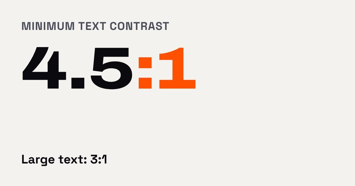
The short version: there's a published number for readable text, and you can check your brand colours against it in five minutes for free. The W3C's accessibility guidelines ask for a contrast ratio of at least 4.5:1 for normal text and 3:1 for large text. Our verdict: pick your brand colours for feel, then test every text and background pair before you print or publish anything.
What is contrast ratio?
It's a score from 1:1 (no difference at all) to 21:1 (black on white) for how far apart two colours are in lightness. The W3C gives the formula, and ratios aren't rounded, so 4.499:1 fails a 4.5:1 requirement. Think of it as volume: the higher the number, the less your reader has to strain to hear the words.
The W3C says the 4.5:1 level is set to make up for the loss of contrast sensitivity that goes with about 20/40 vision, which it describes as typical of people around 80. That's a good reminder that readability isn't a niche concern. It affects anyone who is tired, outdoors or squinting at small print.
What numbers should my text hit?
Normal text needs 4.5:1. Large text needs 3:1, and the W3C defines large as at least 18 point, or 14 point and bold. In screen terms that's about 24 pixels, or about 18.5 pixels bold.
We ran a few common pairs through the W3C's formula to show what that looks like. Treat these as a guide and confirm your own colours with a checker.
| Text on background | Ratio | Normal text | Large text |
|---|---|---|---|
| Near-black #0B0B0F on white | 19.6:1 | Pass | Pass |
| Grey #767676 on white | 4.5:1 | Pass, barely | Pass |
| Grey #777777 on white | 4.48:1 | Fail | Pass |
| Light grey #999999 on white | 2.9:1 | Fail | Fail |
| White on bright orange #FF4F00 | 3.3:1 | Fail | Pass |
| Near-black #0B0B0F on bright orange #FF4F00 | 6.0:1 | Pass | Pass |
The last two rows are the ones to remember. A vivid brand colour often can't carry white text for a paragraph, yet works well with near-black text on top, or with white text in a big headline or button label.
One more note from the same page: fonts with very thin strokes or unusual letterforms may need more contrast than the minimum suggests. A hairline script font in mid-grey can pass on paper and still be tiring to read. If a font is part of your brand, use it for headlines and pick a sturdier one for the paragraphs people actually have to read.
A simple palette makes all of this easier. Three colours is plenty: a dark one for text, a light one for backgrounds, and one accent. That's only three pairs to test, and once they pass, you can reuse them on the website, the menu, the van and the invoice without checking again.
Does my logo have to pass too?
No, but the rest of your brand does. The W3C exempts text that is part of a logo. It also says that low contrast chosen by brand guidelines isn't exempt, and that placeholder text, hover text and focus text are covered. So a pale grey form hint or a faint menu link is on you, not on the logo.
If you're still working out the logo itself, our post on creating the right logo is the place to start.
How do I check my colours?
The WebAIM Contrast Checker takes a foreground and a background colour as hex codes and tells you whether the pair passes for normal and large text. It also checks the stricter 7:1 level and a 3:1 level for graphics and interface parts like button outlines. We couldn't confirm its pricing from its page, so check that yourself.
What we'd tell a client: choose one dark text colour and one light background, treat your accent colour as a highlight rather than a text colour, and test every pair before it goes on a sign, a menu or a button.
How to do it this week
- List the hex codes in your brand: text colour, background, accent, and any grey you use for small print.
- Open the checker and test your body text colour against each background it sits on.
- Test any white or light text on your accent colour, such as button labels.
- Fix failures by darkening the text, not by shrinking it. Smaller text needs more contrast, not less.
- Open your website on your phone outside or near a window, and read your smallest text.
Next step
These five steps cost nothing, so go ahead. If your colours fail and you'd rather have the whole brand sorted once, that's what our branding work is for, and we'll set up your website to match. Book a free call and bring your hex codes.
Drafted with AI help from our notes and checked against the sources above.
This post is general information and our own take, not legal, financial or professional advice for your situation. Prices, features and survey results change, so check the linked sources before you act. Accurate as of November 10, 2026. See our terms.